Thursday 9 April 2015

Finished Magazine Cover, Contents Page and Double Page Spread!

With the completion of my Double Page Spread, all of the required music magazine have been finished! This includes me front cover, contents page and double page spread. As they have been previously drafted, when compared to the ICT drafts that I have done they bear a large similarity in layout to the completed product, as well as in basic colour scheme and text. There are also similarities with the image based design, with only the model's prop being that main difference, and a slightly different ordering of the sell lines being the other difference.


The front cover went through many different stages of design. these included different backgrounds, different font colours and styles, as well as different editing effects on the cover model to remove imperfections and general extra editing. Contrast was also played with in order to fit with the conventional brown and gold colours of a classical music magazine.


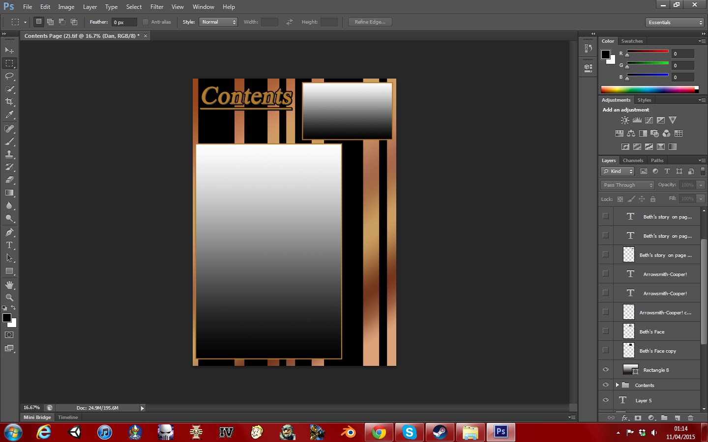
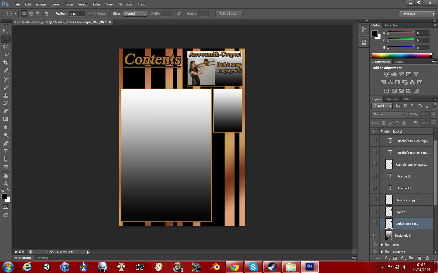
The contents page stays with the theme of the cover page, in terms of the background and colour scheme. the golds and browns continue over to keep within the theme even though the contents page does not need to stand out in the same way as the cover page does. This is done due to a large amount of the page being taken up with the contents box and the small article advertisements, as it contrasts well with the fullness of the foreground.


For the double page spread, I decided to take the theme from the other pages and tone it down a bit, as this page is not one that needs to stand out in the same way that the cover does. This is due to the double page spread being about the article, as that is what readers would look for on this page. The cover model's colours have been tones down to stand out more against the lighter background, and the black text is also used to stand out while sticking with the familiar theme. The headline of this article sticks with the same theme as all of the other pages, making it feel more similar to the other ones.

Audience feedback on these final pieces has been overwhelmingly positive.

Having these pages be displayed over digital means would be very beneficial to the sales of the magazine, and due to the size/shape of the pages and phone screens, a digital version of these should be available to the buyer by scanning a special QR code on the back page that would allow them to view the magazine on their phone. This is particularly important as embracing new media forms such as the internet and convergence devices such as mobile phones can make or break the magazine's success.


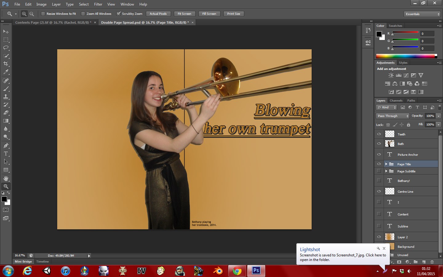
After receiving additional audience feedback in regards to the double page spread, the article was changed to fit more conventionally. this involved changing the Q&A to fit into two columns, which is often seen in magazines more so then the single column layout that was previously used. Credits relating to the image and text have now been added, as this is also conventional of musical magazines.

Thursday 2 April 2015

Q7: Looking back at your preliminary task, what do you feel you have learnt in the progression from it to the full product?


For my First set of coursework, my preliminary task was to produce the front cover and contents page of a fictional college magazine. This was done in preparation for the final task, and to assess my initial skill and ability to create a professional looking magazine.It also allowed us to try, as well as get used to the process of creating a magazine. This also served as an introduction to the different conventions of a music magazine.

Since my first attempt, I have learnt many things such as the correct terminology for a lot of the magazine's important components, like Masthead, sell lines, picture anchor and plug. I have also learnt to use Photoshop more effectively, more specifically the image editing tools such as the spot healing tool and the magnetic lasso. The LIIAR analysis is also a new acronym that I have learnt, and a good method of analysing work.

My preliminary front cover is extremely unconventional when placed in comparison with my newly finished one. However, in making this magazine I learnt why my magazine should not break too many conventions at once, as this leads to an unprofessional looking magazine as well as an unattractive one.I have learn for example that almost all magazines use three set colours, in my later magazine's case gold, brown and black, whereas in my earlier magazine I only used green and white, leaving the whole magazine looking rather unfinished. This also introduced me to the conventional placement of sell lines, the masthead's location, and where the date and issue number should be located.


Throughout my magazine's creation, I consistently compared it to feedback from the preliminary magazine. Although the two were from different topics altogether, it made for good reference for the conventional positioning of elements as well as the identifying of god fonts and colours. This was invaluable for the final product to look professional and please it's intended audience.

Tuesday 24 March 2015

Double Page Spread Progress

The double page spread works from a largely toned down version of the front cover's colour scheme, opting for a more simplistic light gold background with a dark streak where the model is to highlight her amongst the background. This form of simplistic page is conventional of classical music magazines, as they often have an audience more interested in the article then the visuals of the page. This therefore attempts to highlight the text more while keeping in theme with the rest of the magazine. While a centre line is used in the Photoshop document for editing and layout purposes, it is not present in the final double page spread.


Thursday 19 March 2015

Double Page Spread Article Finalised

Having read through and gathered feedback on the original double page spread article, I have revised it to have all correct spellings, correct grammar, points expanded on and shrunken where needed and have altered the text to better help it flow. Here is the final version of the article text:


In one of our most exiting interviews this week, we are able to talk to Bethany Arrowsmith-Cooper, the up and coming Trombone-wielding classical music star. “I never expected to be here, they never said that I was good enough!” Bethany told us, commenting on how her musical tutors had always held her back.
Q: What was it about music that grabbed your interest when deciding what you wanted to do with the rest of your life?
A: It was the thought of being able to create music, share it with others and have them enjoy something that I have made just makes me so happy!
Q: When you were growing up, did you have a lot of support in music? What did your parents think of your choices?
A: My parents were fine with it, they gave me all the support I needed, but my musical tutors were the real problem. I never expected to be here, they never said that I was good enough!
Q: What drove you to pursue music if you were never given the proper support from your tutors?
A: They told me I couldn't do it and I was determined to prove them wrong!
Q: How do you think that has influenced the way you feel about music?
A: Every time that I play something new I think about the time that they sat me down and asked me to stop playing music because they didn't think that I could do it, I think about how sad I felt that day,
and making others happy with my music makes all that sadness feel worth it.
Q: So after all that, you still like to make people happy with your music?
A:Yes, of course! There would be no me if I wasn't my happy bubbly self. I just couldn't carry on doing music if I wasn't happy.
Q: What are your plans now? You've already become a huge star, what’s next for your music?
A: I really don’t know, I've already brought happiness to so many people, I just don’t know what to do now! I will continue with my music, and will tour around the UK bringing my music to new people every day!
While Bethany continues to bring music in the form of ITunes and CDs, she is also going on tour around the UK later on in the year with the dates to be announced. Whenever she does, we’ll be there!

Tuesday 17 March 2015

Contents Page Progress

The contents page is designed to fit more within the theme of the cover page as oppose to what is planned for the double page spread, while also remaining a hybrid of the two styles. It still has the black/brown of the front cover for it's background, but also with mixes of gold to compensate for the lack of gold with the cover model and her prop not being present. It further hybrids the two, having a large amount of gold test with a grey shadow and black border, but also using a completely gold colour for the text that is on the contents table as oppose to the planned solid black text for the double page spread. This gold was chosen over the black to make the text more readable.